Association rule learning is used in machine learning for discovering interesting relations between variables. Apriori algorithm is a popular algorithm for association rules mining and extracting frequent itemsets with applications in association rule learning. It has been designed to operate on databases containing transactions, such as purchases by customers of a store (market basket analysis). [1] Besides market basket analysis this algorithm can be applied to other problems. For example in web user navigation domain we can search for rules like customer who visited web page A and page B also visited page C.
Python sklearn library does not have Apriori algorithm but recently I come across post [3] where python library MLxtend was used for Market Basket Analysis. MLxtend has modules for different tasks. In this post I will share how to create data visualization for association rules in data mining using MLxtend for getting association rules and NetworkX module for charting the diagram. First we need to get association rules.
Getting Association Rules from Array Data
To get association rules you can run the following code[4]
dataset = [['Milk', 'Onion', 'Nutmeg', 'Kidney Beans', 'Eggs', 'Yogurt'],
           ['Dill', 'Onion', 'Nutmeg', 'Kidney Beans', 'Eggs', 'Yogurt'],
           ['Milk', 'Apple', 'Kidney Beans', 'Eggs'],
           ['Milk', 'Unicorn', 'Corn', 'Kidney Beans', 'Yogurt'],
           ['Corn', 'Onion', 'Onion', 'Kidney Beans', 'Ice cream', 'Eggs']]


import pandas as pd
from mlxtend.preprocessing import OnehotTransactions
from mlxtend.frequent_patterns import apriori

oht = OnehotTransactions()
oht_ary = oht.fit(dataset).transform(dataset)
df = pd.DataFrame(oht_ary, columns=oht.columns_)
print (df)

frequent_itemsets = apriori(df, min_support=0.6, use_colnames=True)
print (frequent_itemsets)

association_rules(frequent_itemsets, metric="confidence", min_threshold=0.7)
rules = association_rules(frequent_itemsets, metric="lift", min_threshold=1.2)
print (rules)

"""
Below is the output
    support                     itemsets
0       0.8                       [Eggs]
1       1.0               [Kidney Beans]
2       0.6                       [Milk]
3       0.6                      [Onion]
4       0.6                     [Yogurt]
5       0.8         [Eggs, Kidney Beans]
6       0.6                [Eggs, Onion]
7       0.6         [Kidney Beans, Milk]
8       0.6        [Kidney Beans, Onion]
9       0.6       [Kidney Beans, Yogurt]
10      0.6  [Eggs, Kidney Beans, Onion]

             antecedants            consequents  support  confidence  lift
0  (Kidney Beans, Onion)                 (Eggs)      0.6        1.00  1.25
1   (Kidney Beans, Eggs)                (Onion)      0.8        0.75  1.25
2                (Onion)   (Kidney Beans, Eggs)      0.6        1.00  1.25
3                 (Eggs)  (Kidney Beans, Onion)      0.8        0.75  1.25
4                (Onion)                 (Eggs)      0.6        1.00  1.25
5                 (Eggs)                (Onion)      0.8        0.75  1.25

"""
Confidence and Support in Data Mining
To select interesting rules we can use best-known constraints which are a minimum thresholds on confidence and support.
Support is an indication of how frequently the itemset appears in the dataset.
Confidence is an indication of how often the rule has been found to be true. [5]
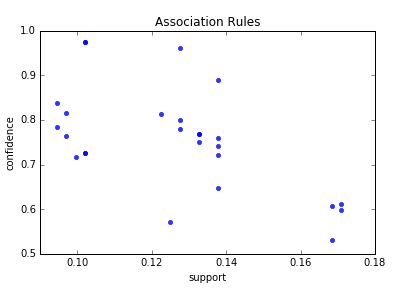
support=rules.as_matrix(columns=['support'])
confidence=rules.as_matrix(columns=['confidence'])
Below is the scatter plot for support and confidence:

And here is the python code to build scatter plot. Since few points here have the same values I added small random values to show all points.
import random
import matplotlib.pyplot as plt


for i in range (len(support)):
   support[i] = support[i] + 0.0025 * (random.randint(1,10) - 5)
   confidence[i] = confidence[i] + 0.0025 * (random.randint(1,10) - 5)

plt.scatter(support, confidence,   alpha=0.5, marker="*")
plt.xlabel('support')
plt.ylabel('confidence')
plt.show()
How to Create Data Visualization with NetworkX for Association Rules in Data Mining
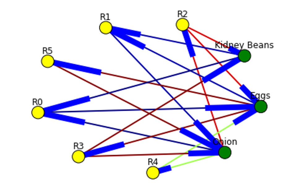
To represent association rules as diagram, NetworkX python library is utilized in this post. Here is the association rule example :
(Kidney Beans, Onion) ==> (Eggs)
Directed graph below is built for this rule and shown below. Arrows are drawn as just thicker blue stubs. The node with R0 identifies one rule, and it will have always incoming and outcoming edges. Incoming edge(s) will represent antecedants and the stub (arrow) will be next to node.

Below is the example of graph for all rules extracted from example dataset.
Here is the source code to build association rules with NetworkX. To call function use draw_graph(rules, 6)
def draw_graph(rules, rules_to_show):
  import networkx as nx
  G1 = nx.DiGraph()

  color_map=[]
  N = 50
  colors = np.random.rand(N)
  strs=['R0', 'R1', 'R2', 'R3', 'R4', 'R5', 'R6', 'R7', 'R8', 'R9', 'R10', 'R11']


  for i in range (rules_to_show):
    G1.add_nodes_from(["R"+str(i)])


    for a in rules.iloc[i]['antecedants']:

        G1.add_nodes_from([a])

        G1.add_edge(a, "R"+str(i), color=colors[i] , weight = 2)

    for c in rules.iloc[i]['consequents']:

            G1.add_nodes_from()

            G1.add_edge("R"+str(i), c, color=colors[i],  weight=2)

  for node in G1:
       found_a_string = False
       for item in strs:
           if node==item:
                found_a_string = True
       if found_a_string:
            color_map.append('yellow')
       else:
            color_map.append('green')


  edges = G1.edges()
  colors = [G1[u][v]['color'] for u,v in edges]
  weights = [G1[u][v]['weight'] for u,v in edges]

  pos = nx.spring_layout(G1, k=16, scale=1)
  nx.draw(G1, pos, edges=edges, node_color = color_map, edge_color=colors, width=weights, font_size=16, with_labels=False)

  for p in pos:  # raise text positions
           pos[p][1] += 0.07
  nx.draw_networkx_labels(G1, pos)
  plt.show()
Data Visualization for Online Retail Data Set
To get real feeling and testing on visualization we can take available online retail store dataset[6] and apply the code for association rules graph. For downloading retail data and formatting some columns the code from [3] was used.
Below are the result of scatter plot for support and confidence. To build the scatter plot seaborn library was used this time. Also you can find below visualization for association rules (first 10 rules) for retail data set.

Here is the python full source code for data visualization association rules in data mining.
dataset = [['Milk', 'Onion', 'Nutmeg', 'Kidney Beans', 'Eggs', 'Yogurt'],
           ['Dill', 'Onion', 'Nutmeg', 'Kidney Beans', 'Eggs', 'Yogurt'],
           ['Milk', 'Apple', 'Kidney Beans', 'Eggs'],
           ['Milk', 'Unicorn', 'Corn', 'Kidney Beans', 'Yogurt'],
           ['Corn', 'Onion', 'Onion', 'Kidney Beans', 'Ice cream', 'Eggs']]


import pandas as pd
from mlxtend.preprocessing import OnehotTransactions
from mlxtend.frequent_patterns import apriori

oht = OnehotTransactions()
oht_ary = oht.fit(dataset).transform(dataset)
df = pd.DataFrame(oht_ary, columns=oht.columns_)
print (df)

frequent_itemsets = apriori(df, min_support=0.6, use_colnames=True)
print (frequent_itemsets)

from mlxtend.frequent_patterns import association_rules

association_rules(frequent_itemsets, metric="confidence", min_threshold=0.7)
rules = association_rules(frequent_itemsets, metric="lift", min_threshold=1.2)
print (rules)

support=rules.as_matrix(columns=['support'])
confidence=rules.as_matrix(columns=['confidence'])


import random
import matplotlib.pyplot as plt


for i in range (len(support)):
   support[i] = support[i] + 0.0025 * (random.randint(1,10) - 5)
   confidence[i] = confidence[i] + 0.0025 * (random.randint(1,10) - 5)

plt.scatter(support, confidence,   alpha=0.5, marker="*")
plt.xlabel('support')
plt.ylabel('confidence')
plt.show()

import numpy as np

def draw_graph(rules, rules_to_show):
  import networkx as nx
  G1 = nx.DiGraph()

  color_map=[]
  N = 50
  colors = np.random.rand(N)
  strs=['R0', 'R1', 'R2', 'R3', 'R4', 'R5', 'R6', 'R7', 'R8', 'R9', 'R10', 'R11']


  for i in range (rules_to_show):
    G1.add_nodes_from(["R"+str(i)])


    for a in rules.iloc[i]['antecedants']:

        G1.add_nodes_from([a])

        G1.add_edge(a, "R"+str(i), color=colors[i] , weight = 2)

    for c in rules.iloc[i]['consequents']:

            G1.add_nodes_from()

            G1.add_edge("R"+str(i), c, color=colors[i],  weight=2)

  for node in G1:
       found_a_string = False
       for item in strs:
           if node==item:
                found_a_string = True
       if found_a_string:
            color_map.append('yellow')
       else:
            color_map.append('green')


  edges = G1.edges()
  colors = [G1[u][v]['color'] for u,v in edges]
  weights = [G1[u][v]['weight'] for u,v in edges]

  pos = nx.spring_layout(G1, k=16, scale=1)
  nx.draw(G1, pos, edges=edges, node_color = color_map, edge_color=colors, width=weights, font_size=16, with_labels=False)

  for p in pos:  # raise text positions
           pos[p][1] += 0.07
  nx.draw_networkx_labels(G1, pos)
  plt.show()


draw_graph (rules, 6)


df = pd.read_excel('http://archive.ics.uci.edu/ml/machine-learning-databases/00352/Online%20Retail.xlsx')


df['Description'] = df['Description'].str.strip()
df.dropna(axis=0, subset=['InvoiceNo'], inplace=True)
df['InvoiceNo'] = df['InvoiceNo'].astype('str')
df = df[~df['InvoiceNo'].str.contains('C')]

basket = (df[df['Country'] =="France"]
          .groupby(['InvoiceNo', 'Description'])['Quantity']
          .sum().unstack().reset_index().fillna(0)
          .set_index('InvoiceNo'))

def encode_units(x):
    if x <= 0:
        return 0
    if x >= 1:
        return 1

basket_sets = basket.applymap(encode_units)
basket_sets.drop('POSTAGE', inplace=True, axis=1)

frequent_itemsets = apriori(basket_sets, min_support=0.07, use_colnames=True)

rules = association_rules(frequent_itemsets, metric="lift", min_threshold=1)
rules.head()

print (rules)


support=rules.as_matrix(columns=['support'])
confidence=rules.as_matrix(columns=['confidence'])

import seaborn as sns1

for i in range (len(support)):
    support[i] = support[i]
    confidence[i] = confidence[i]

plt.title('Association Rules')
plt.xlabel('support')
plt.ylabel('confidence')
sns1.regplot(x=support, y=confidence, fit_reg=False)

plt.gcf().clear()
draw_graph (rules, 10)
References
1. MLxtend Apriori
2. mlxtend-latest
3. Introduction to Market Basket Analysis in Python
4. MLxtends-documentation
5. Association rule learning
6. Online Retail Data Set
i am getting this error while running the func draw_graph(). help please
TypeError: add_nodes_from() missing 1 required positional argument: ‘nodes’
Hi Waleed,
did you check this link https://stackoverflow.com/questions/44531170/python-is-throwing-typeerror-add-nodes-missing-1-required-positional-argument ?
It is discussing the same error.
Thanks.
Error is due to this line,
for c in rules.iloc[i][‘consequents’]:
G1.add_nodes_from()
update G1.add_nodes_from() to G1.add_nodes_from([c]) to solve this.
i got this error:
“‘type’ object is not subscriptable”
on
G1.add_edge(c, “R”+str[i],color=colors[i], weight=2)
anyone know the solution for this?
Make sure that c is correct type , need to be array , also check – I believe edge names should not have spaces.
Thanks.
how to quote this site?
Hi Bong Ju Kang,
thanks for interest in this site.
You can quote like Machine Learning Applications at https://intelligentonlinetools.com/blog/
If you want refer to this specific link you can use this url https://intelligentonlinetools.com/blog/2018/02/10/how-to-create-data-visualization-for-association-rules-in-data-mining/ with the title How to Create Data Visualization for Association Rules in Data Mining
Thanks and Best regards,
owygs156