3 Most Useful Examples to Add Interactivity to Graph Data Using Bokeh Library

Bokeh is a Python library for building advanced and modern data visualization web applications. Bokeh allows to add interactive controls like slider, buttons, dropdown menu and so on to the data graphs. Bokeh provides a variety of ways to embed plots and data into HTML documents including generating standalone HTML documents. [6]

There is a sharp increase of popularity for Bokeh data visualization libraries (Fig 1), reflecting the increased interest in machine learning and data science over the last few years.
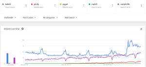
Fig 1. Trend for Bokeh and Other Data Visualizations Libraries. Source: Google Trends

In this post we put together 4 most common examples of data plots using Bokeh. The examples include such popular controls like slider, button. They use loading data from data files which is common situation in practice. The examples show how to add create plot and how to add interactivity using Bokeh and will help to make quick start in using Bokeh.

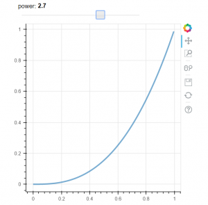
Our first example demonstrates how to add interactivity with slide control. This example is taken from Bokeh documentation [4]. When we change the slider value the line is changing its properties. See Fig 2 for example how the plot is changing. The example is using callbak function attached to slider control.


# -*- coding: utf-8 -*-

from bokeh.layouts import column
from bokeh.models import CustomJS, ColumnDataSource, Slider
from bokeh.plotting import Figure, output_file, show

# fetch and clear the document
from bokeh.io import curdoc
curdoc().clear()

output_file("callback.html")

x = [x*0.005 for x in range(0, 200)]
y = x

source = ColumnDataSource(data=dict(x=x, y=y))

plot = Figure(plot_width=400, plot_height=400)
plot.line('x', 'y', source=source, line_width=3, line_alpha=0.6)

def callback(source=source, window=None):
    data = source.data
    f = cb_obj.value
    x, y = data['x'], data['y']
    for i in range(len(x)):
        y[i] = window.Math.pow(x[i], f)
    source.trigger('change')

slider = Slider(start=0.1, end=4, value=1, step=.1, title="power",
                callback=CustomJS.from_py_func(callback))

layout = column(slider, plot)

show(layout)

Alternatively we can attach callback through the js_on_change method of Bokeh slider model:


callback = CustomJS(args=dict(source=source), code="""
    var data = source.data;
    var f = cb_obj.value
    x = data['x']
    y = data['y']
    for (i = 0; i < x.length; i++) {
        y[i] = Math.pow(x[i], f)
    }
    source.trigger('change');
""")

slider = Slider(start=0.1, end=4, value=1, step=.1, title="power")
slider.js_on_change('value', callback)
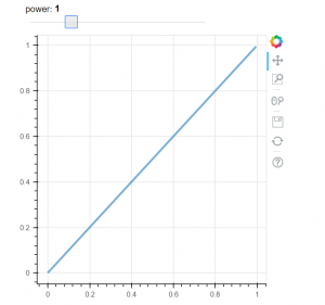
Fig 2A. Initial Data plot
Fig 2B. Data plot after changed slider position

Our second example shows how to use button control. In this example we use Button on_click method to change graph.


# -*- coding: utf-8 -*-

from bokeh.layouts import column
from bokeh.models import CustomJS, ColumnDataSource
from bokeh.plotting import Figure, output_file, show

from bokeh.io import curdoc
curdoc().clear()

from bokeh.models.widgets import Button
output_file("button.html")


x = [x*0.05 for x in range(0, 200)]
y = x

source = ColumnDataSource(data=dict(x=x, y=y))

plot = Figure(plot_width=400, plot_height=400)
plot.line('x', 'y', source=source, line_width=3, line_alpha=0.6)

callback = CustomJS(args=dict(source=source), code="""
    var data = source.data;
    x = data['x']
    y = data['y']
    for (i = 0; i < x.length; i++) {
        y[i] = Math.pow(x[i], 4)
    }
    source.trigger('change');
""")


toggle1 = Button(label="Change Graph", callback=callback, name="1")
layout = column(toggle1 , plot)

show(layout)

Our 3rd example demonstrates how to load data from csv data file. This example is borrowed from stackoverflow [5] In this example we also use button, but here we load data from file to dataframe. We use two buttons, two files and 2 dataframes, the buttons allow to switch between data files and reload the graph.


# -*- coding: utf-8 -*-
from bokeh.io import vplot
import pandas as pd
from bokeh.models import CustomJS, ColumnDataSource
from bokeh.models.widgets import Button
from bokeh.plotting import figure, output_file, show

output_file("load_data_buttons.html")

df1 = pd.read_csv("data_file_1.csv")
df2 = pd.read_csv("data_file_2.csv")

df1.columns = df1.columns.str.strip()
df2.columns = df2.columns.str.strip()
plot = figure(plot_width=400, plot_height=400, title="xxx")
source = ColumnDataSource(data=dict(x=[0, 1], y=[0, 1]))
source2 = ColumnDataSource(data=dict(x1=df1.x.values, y1=df1.y.values, 
                                    x2=df2.x.values, y2=df2.y.values))

plot.line('x', 'y', source=source, line_width=3, line_alpha=0.6)

callback = CustomJS(args=dict(source=source, source2=source2), code="""
        var data = source.get('data');
        var data2 = source2.get('data');
        data['x'] = data2['x' + cb_obj.get("name")];
        data['y'] = data2['y' + cb_obj.get("name")];
        source.trigger('change');
    """)

toggle1 = Button(label="Load data file 1", callback=callback, name="1")
toggle2 = Button(label="Load data file 2", callback=callback, name="2")

layout = vplot(toggle1, toggle2, plot)

show(layout)

As mentioned on the web, Interactive data visualizations turn plots into powerful interfaces for data exploration. [7] The shown above examples demonstrate how to make the graph data interactive and hope will help to make quick start in this direction.

References
1. 5 Python Libraries for Creating Interactive Plots
2. 10 Useful Python Data Visualization Libraries for Any Discipline
3. The Most Popular Language For Machine Learning and Data Science
4. Welcome to Bokeh
5. Load graph data from files on button click with bokeh
6. Embedding Plots and Apps
7. How effective data visualizations let users have a conversation with data

Data Visualization – Visualizing an LDA Model using Python

In the previous post Topic Extraction from Blog Posts with LSI , LDA and Python python code was created for text documents topic modeling using Latent Dirichlet allocation (LDA) method.
The output was just an overview of the words with corresponding probability distribution for each topic and it was hard to use the results. So in this post we will implement python code for LDA results visualization.

As before we will run LDA the same way from the same data input.

After LDA is done we get needed data for visualization using the following statement:


topicWordProbMat = ldamodel.print_topics(K)

Here is the example of output of topicWordProbMat (shown partially):

[(0, ‘0.016*”use” + 0.013*”extract” + 0.011*”web” + 0.011*”script” + 0.011*”can” + 0.010*”link” + 0.009*”comput” + 0.008*”intellig” + 0.008*”modul” + 0.007*”page”‘), (1, ‘0.037*”cloud” + 0.028*”tag” + 0.018*”number” + 0.015*”life” + 0.013*”path” + 0.012*”can” + 0.010*”word” + 0.008*”gener” + 0.007*”web” + 0.006*”born”‘), ……..

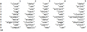
Using topicWordProbMat we will prepare matrix with the probabilities of words per each topic and per each word. We will prepare also dataframe and will output it in the table format, each column for topic, showing the words for each topic in the column. This is very useful to review results and decide if some words need to be removed. For example I see that I need remove some words like “will”, “use”, “can”.

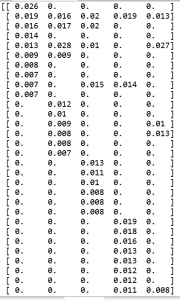
Below is the code for preparation of dataframe and matrix. The matrix zz is showing probability for each word and topic. Here we create empty dataframe df and then populate it element by element. Word Topic DataFrame is shown in the end of this post.


import pandas as pd
import numpy as np

columns = ['1','2','3','4','5']

df = pd.DataFrame(columns = columns)
pd.set_option('display.width', 1000)

# 40 will be resized later to match number of words in DC
zz = np.zeros(shape=(40,K))

last_number=0
DC={}

for x in range (10):
  data = pd.DataFrame({columns[0]:"",
                     columns[1]:"",
                     columns[2]:"",
                     columns[3]:"",
                     columns[4]:"",
                                                                                       
                     
                    },index=[0])
  df=df.append(data,ignore_index=True)  
    
for line in topicWordProbMat:
    
    tp, w = line
    probs=w.split("+")
    y=0
    for pr in probs:
               
        a=pr.split("*")
        df.iloc[y,tp] = a[1]
       
        if a[1] in DC:
           zz[DC[a[1]]][tp]=a[0]
        else:
           zz[last_number][tp]=a[0]
           DC[a[1]]=last_number
           last_number=last_number+1
        y=y+1

print (df)
print (zz)

The matrix zz will be used now for creating plot for visualization. Such plot can be called heatmap. Below is the code for this. The dark areas correspondent to 0 probability and the areas with less dark and more white correspondent to higher word probabilities for the given word and topic. Word topic map is shown in the end of this post.


import matplotlib.pyplot as plt

zz=np.resize(zz,(len(DC.keys()),zz.shape[1]))

for val, key in enumerate(DC.keys()):
        plt.text(-2.5, val + 0.5, key,
                 horizontalalignment='center',
                 verticalalignment='center'
                 )

plt.imshow(zz, cmap='hot', interpolation='nearest')
plt.show()

Below is the output from running python code.

Word Topic DataFrame


Word Topic Map


Matrix Data

Below is the full source code of the script.


# -*- coding: utf-8 -*-
     
import csv
from stop_words import get_stop_words
from nltk.stem.porter import PorterStemmer
from gensim import corpora
import gensim
import re
from nltk.tokenize import RegexpTokenizer

def remove_html_tags(text):
        """Remove html tags from a string"""
     
        clean = re.compile('<.*?>')
        return re.sub(clean, '', text)

tokenizer = RegexpTokenizer(r'\w+')

# use English stop words list
en_stop = get_stop_words('en')

# use p_stemmer of class PorterStemmer
p_stemmer = PorterStemmer()

fn="posts.csv" 
doc_set = []

with open(fn, encoding="utf8" ) as f:
            csv_f = csv.reader(f)
            for i, row in enumerate(csv_f):
               if i > 1 and len(row) > 1 :
                
                 temp=remove_html_tags(row[1]) 
                 temp = re.sub("[^a-zA-Z ]","", temp)
                 doc_set.append(temp)
              
texts = []

for i in doc_set:
    # clean and tokenize document string
    raw = i.lower()
    raw=' '.join(word for word in raw.split() if len(word)>2)    

    raw=raw.replace("nbsp", "")
    tokens = tokenizer.tokenize(raw)
   
    stopped_tokens = [i for i in tokens if not i in en_stop]
    stemmed_tokens = [p_stemmer.stem(i) for i in stopped_tokens]
    texts.append(stemmed_tokens)
# turn our tokenized documents into a id <-> term dictionary
dictionary = corpora.Dictionary(texts)
# convert tokenized documents into a document-term matrix
corpus = [dictionary.doc2bow(text) for text in texts]
ldamodel = gensim.models.ldamodel.LdaModel(corpus, num_topics=5, id2word = dictionary, passes=20)
print (ldamodel)
print(ldamodel.print_topics(num_topics=3, num_words=3))
for i in  ldamodel.show_topics(num_words=4):
    print (i[0], i[1])

# Get Per-topic word probability matrix:
K = ldamodel.num_topics
 
topicWordProbMat = ldamodel.print_topics(K)
print (topicWordProbMat) 
 
for t in texts:
     vec = dictionary.doc2bow(t)
     print (ldamodel[vec])

import pandas as pd
import numpy as np
columns = ['1','2','3','4','5']
df = pd.DataFrame(columns = columns)
pd.set_option('display.width', 1000)

# 40 will be resized later to match number of words in DC
zz = np.zeros(shape=(40,K))

last_number=0
DC={}

for x in range (10):
  data = pd.DataFrame({columns[0]:"",
                     columns[1]:"",
                     columns[2]:"",
                     columns[3]:"",
                     columns[4]:"",
                                                                                 
                   
                    },index=[0])
  df=df.append(data,ignore_index=True)  
   
for line in topicWordProbMat:

    tp, w = line
    probs=w.split("+")
    y=0
    for pr in probs:
               
        a=pr.split("*")
        df.iloc[y,tp] = a[1]
       
        if a[1] in DC:
           zz[DC[a[1]]][tp]=a[0]
        else:
           zz[last_number][tp]=a[0]
           DC[a[1]]=last_number
           last_number=last_number+1
        y=y+1
 
print (df)
print (zz)
import matplotlib.pyplot as plt
zz=np.resize(zz,(len(DC.keys()),zz.shape[1]))

for val, key in enumerate(DC.keys()):
        plt.text(-2.5, val + 0.5, key,
                 horizontalalignment='center',
                 verticalalignment='center'
                 )
plt.imshow(zz, cmap='hot', interpolation='nearest')
plt.show()


Using Python for Data Visualization of Clustering Results

In one of the previous post http://intelligentonlinetools.com/blog/2016/05/28/using-python-for-mining-data-from-twitter/ python source code for mining Twitter data was implemented. Clustering was applied to put tweets in different groups using bag of words representation for the text. The results of clustering were obtained via numerical matrix. Now we will look at visualization of clustering results using python. Also we will do some additional data cleaning before clustering.

Data preprocessing
The following actions are added before clustering :

  • Retweet tweets always start with text in the form “RT @name: “. The code is added to remove this text.
  • Special characters like #, ! are removed.
  • URL links are removed.
  • All numerical numbers also removed.
  • Duplicates tweets retweets are removed – we keep only one tweet

Below is the code for the above preprocessing steps. See full source code for functions right, remove_duplicates.


for counter, t in enumerate(texts):
    if t.startswith("rt @"):
          pos= t.find(": ")
          texts[counter] = right(t, len(t) - (pos+2))
          
for counter, t in enumerate(texts):
    texts[counter] = re.sub(r'[?|$|.|!|#|\-|"|\n|,|@|(|)]',r'',texts[counter])
    texts[counter] = re.sub(r'https?:\/\/.*[\r\n]*', '', texts[counter], flags=re.MULTILINE)
    texts[counter] = re.sub(r'[0|1|2|3|4|5|6|7|8|9|:]',r'',texts[counter]) 
    texts[counter] = re.sub(r'deeplearning',r'deep learning',texts[counter])      
        
texts= remove_duplicates(texts)

Plotting
The vector-space models as a choosen model for representing word meanings in this example is the problem in multidimensional space. The number of different words is high even for small set of data. There is however a tool t-SNE to visualize high-dimensional data. It converts similarities between data points to joint probabilities and tries to minimize the Kullback-Leibler divergence between the joint probabilities of the low-dimensional embedding and the high-dimensional data. t-SNE has a cost function that is not convex, i.e. with different initializations we can get different results. [1] Below is the python source code for building plot for visualization of clustering results.


from sklearn.manifold import TSNE

model = TSNE(n_components=2, random_state=0)
np.set_printoptions(suppress=True)
Y=model.fit_transform(train_data_features)

plt.scatter(Y[:, 0], Y[:, 1], c=clustering_result, s=290,alpha=.5)
plt.show()

The resulting visualization is shown below

Data Visualization for Clustering Results

Analysis
Additionally to visualization the silhouette_score was computed and the obtained value was around 0.2


silhouette_avg = silhouette_score(train_data_features, clustering_result)

The silhouette_score gives the average value for all the samples. This gives a perspective into the density and separation of the formed clusters.
Silhoette coefficients (as these values are referred to as) near +1 indicate that the sample is far away from the neighboring clusters. A value of 0 indicates that the sample is on or very close to the decision boundary between two neighboring clusters and negative values indicate that those samples might have been assigned to the wrong cluster. [2]

Thus in this post python script for visualization of clustering results was provided. The clustering was applied to results of Twitter search for some specific phrase.

It should be noted that clustering of tweets data is challenging as the tweet length can be only 140 characters or less. Such problems are related to short text clustering and there are some additional technique that can be applied to get better results. [3]-[6]
Below is the full script code.


import twitter
import json

import matplotlib.pyplot as plt
import numpy as np

from sklearn.feature_extraction.text import CountVectorizer
from sklearn.cluster import Birch
from sklearn.manifold import TSNE

import re

from sklearn.metrics import silhouette_score

# below function is from
# http://www.dotnetperls.com/duplicates-python
def remove_duplicates(values):
    output = []
    seen = set()
    for value in values:
        # If value has not been encountered yet,
        # ... add it to both list and set.
        if value not in seen:
            output.append(value)
            seen.add(value)
    return output

# below 2 functions are from
# http://stackoverflow.com/questions/22586286/
#         python-is-there-an-equivalent-of-mid-right-and-left-from-basic
def left(s, amount = 1, substring = ""):
    if (substring == ""):
        return s[:amount]
    else:
        if (len(substring) > amount):
            substring = substring[:amount]
        return substring + s[:-amount]

def right(s, amount = 1, substring = ""):
    if (substring == ""):
        return s[-amount:]
    else:
        if (len(substring) > amount):
            substring = substring[:amount]
        return s[:-amount] + substring


CONSUMER_KEY ="xxxxxxx"
CONSUMER_SECRET ="xxxxxxx"
OAUTH_TOKEN = "xxxxxx"
OAUTH_TOKEN_SECRET = "xxxxxx"


auth = twitter.oauth.OAuth (OAUTH_TOKEN, OAUTH_TOKEN_SECRET, CONSUMER_KEY, CONSUMER_SECRET)

twitter_api= twitter.Twitter(auth=auth)
q='#deep learning'
count=100

# Do search for tweets containing '#deep learning'
search_results = twitter_api.search.tweets (q=q, count=count)

statuses=search_results['statuses']

# Iterate through 5 more batches of results by following the cursor
for _ in range(5):
   print ("Length of statuses", len(statuses))
   try:
        next_results = search_results['search_metadata']['next_results']
   except KeyError:   
       break
   # Create a dictionary from next_results
   kwargs=dict( [kv.split('=') for kv in next_results[1:].split("&") ])

   search_results = twitter_api.search.tweets(**kwargs)
   statuses += search_results['statuses']

# Show one sample search result by slicing the list
print (json.dumps(statuses[0], indent=10))


# Extracting data such as hashtags, urls, texts and created at date
hashtags = [ hashtag['text'].lower()
    for status in statuses
       for hashtag in status['entities']['hashtags'] ]


urls = [ urls['url']
    for status in statuses
       for urls in status['entities']['urls'] ]


texts = [ status['text'].lower()
    for status in statuses
        ]

created_ats = [ status['created_at']
    for status in statuses
        ]

# Preparing data for trending in the format: date word
i=0
print ("===============================\n")
for x in created_ats:
     for w in texts[i].split(" "):
        if len(w)>=2:
              print (x[4:10], x[26:31] ," ", w)
     i=i+1

# Prepare tweets data for clustering
# Converting text data into bag of words model

vectorizer = CountVectorizer(analyzer = "word", \
                             tokenizer = None,  \
                             preprocessor = None,  \
                             stop_words='english', \
                             max_features = 5000) 


for counter, t in enumerate(texts):
    if t.startswith("rt @"):
          pos= t.find(": ")
          texts[counter] = right(t, len(t) - (pos+2))
          
for counter, t in enumerate(texts):
    texts[counter] = re.sub(r'[?|$|.|!|#|\-|"|\n|,|@|(|)]',r'',texts[counter])
    texts[counter] = re.sub(r'https?:\/\/.*[\r\n]*', '', texts[counter], flags=re.MULTILINE)
    texts[counter] = re.sub(r'[0|1|2|3|4|5|6|7|8|9|:]',r'',texts[counter]) 
    texts[counter] = re.sub(r'deeplearning',r'deep learning',texts[counter])      
        
texts= remove_duplicates(texts)  

train_data_features = vectorizer.fit_transform(texts)
train_data_features = train_data_features.toarray()

print (train_data_features.shape)
print (train_data_features)

vocab = vectorizer.get_feature_names()
print (vocab)

dist = np.sum(train_data_features, axis=0)

# For each, print the vocabulary word and the number of times it 
# appears in the training set
for tag, count in zip(vocab, dist):
    print (count, tag)


# Clustering data
n_clusters=7
brc = Birch(branching_factor=50, n_clusters=n_clusters, threshold=0.5,  compute_labels=True)
brc.fit(train_data_features)

clustering_result=brc.predict(train_data_features)
print ("\nClustering_result:\n")
print (clustering_result)

# Outputting some data
print (json.dumps(hashtags[0:50], indent=1))
print (json.dumps(urls[0:50], indent=1))
print (json.dumps(texts[0:50], indent=1))
print (json.dumps(created_ats[0:50], indent=1))


with open("data.txt", "a") as myfile:
     for w in hashtags: 
           myfile.write(str(w.encode('ascii', 'ignore')))
           myfile.write("\n")


# count of word frequencies
wordcounts = {}
for term in hashtags:
    wordcounts[term] = wordcounts.get(term, 0) + 1


items = [(v, k) for k, v in wordcounts.items()]
print (len(items))

xnum=[i for i in range(len(items))]
for count, word in sorted(items, reverse=True):
    print("%5d %s" % (count, word))


for x in created_ats:
  print (x)
  print (x[4:10])
  print (x[26:31])
  print (x[4:7])


plt.figure(1)
plt.title("Frequency of Hashtags")

myarray = np.array(sorted(items, reverse=True))

plt.xticks(xnum, myarray[:,1],rotation='vertical')
plt.plot (xnum, myarray[:,0])
plt.show()


model = TSNE(n_components=2, random_state=0)
np.set_printoptions(suppress=True)
Y=model.fit_transform(train_data_features)
print (Y)


plt.figure(2)
plt.scatter(Y[:, 0], Y[:, 1], c=clustering_result, s=290,alpha=.5)

for j in range(len(texts)):    
   plt.annotate(clustering_result[j],xy=(Y[j][0], Y[j][1]),xytext=(0,0),textcoords='offset points')
   print ("%s %s" % (clustering_result[j],  texts[j]))
            
plt.show()

silhouette_avg = silhouette_score(train_data_features, clustering_result)
print("For n_clusters =", n_clusters, "The average silhouette_score is :", silhouette_avg)

References

1. sklearn.manifold.TSNE
2. plot_kmeans_silhouette_analysis
3. A new AntTree-based algorithm for clustering short-text corpora Marcelo Luis Errecalde, Diego Alejandro Ingaramo, Paolo Rosso, JCS&T Vol. 10 No. 1
4. Crest: Cluster-based Representation
Enrichment for Short Text Classification
Zichao Dai, Aixin Sun, Xu-Ying Liu
5. Enriching short text representation in microblog for clustering Jiliang TANG , Xufei WANG, Huiji GAO, Xia HU, Huan LIU, Front. Comput. Sci., 2012, 6(1)
6. Clustering Short Texts using Wikipedia Somnath Banerjee, Krishnan Ramanathan, Ajay Gupta, HPL-2008-41