Prediction on Next Stock Market Correction

On Feb. 6, 2018, the stock market officially entered “correction” territory. A stock market correction is defined as a drop of at least 10% or more for an index or stock from its recent high. [1] During one week the stock data prices (closed price) were decreasing for many stocks. Are there any signals that can be used to predict next stock market correction?

I pulled historical data from 20 stocks selected randomly and then created python program that counts how many stocks (closed price) were decreased, increased or did not change for each day (comparing with previous day). The numbers then converted into percentage. So if all 20 stock closed prices decreased at some day it would be 100%. For now I was just looking at % of decreased stocks per day. Below is the graph for decreasing stocks. Highlighted zone A is when we many decreasing stocks during the correction.

Number of decreasing stocks per day in %

Observations

I did not find good strong signal to predict market correction but probably more analysis needed. However before this correction there was some increasing trend for number of stocks that close at lower prices. This is shown below. On this graph the trend line can be viewed as indicator of stock market direction.

Number-of-decreasing-stocks-per-day-before-correction
Number of decreasing stocks per day before correction in %

Python Source Code to download Stock Data

Here is the script that was used to download data:

from pandas_datareader import data as pdr 
import time   

# put below actual symbols as many as you need
symbols=['XXX','XXX', 'XXX', ...... 'XXX']
 

def get_data (symbol):
    
    data = pdr.get_data_google(symbol,'1970-01-01','2018-02-19')
    path="C:\\Users\\stocks\\"
    data.to_csv( path + symbol+".csv")
 
    return data


for symbol in symbols:
        get_data(symbol)    
        time.sleep(7)

Script for Stock Data Analysis

Here is the program that takes downloaded data and counts the number of decreased/increased/same stocks per day. The results are saved in the file and also plotted. Plots are shown after source code below.

And here is the link to the data output from the below program.

# -*- coding: utf-8 -*-

import os

path="C:\\Users\\stocks\\"
from datetime import datetime
import pandas as pd
import numpy as np

def days_between(d1, d2):
    d1 = datetime.strptime(d1, "%Y-%m-%d")
    d2 = datetime.strptime(d2, "%Y-%m-%d")
    print (d1)
    print (d2)
    return abs((d2 - d1).days)


i=10000   # index to replace date
j=20      # index for stock symbols
k=5       # other attributes
data = np.zeros((i,j,k))           
symbols=[]           

count=0        

# get index of previous trade day
# because there is no trades on weekend or holidays
# need to calculate prvious trade day index instead
# of just subracting 1
def get_previous_ind(row_ind, col_count ):
    
    k=1
    print (str(row_ind) + "   " + str(col_count))
    while True:
        if  data[row_ind-k][col_count][0] == 1:
            return row_ind-k
        else:
            k=k+1
    
        if k > 1000 :
            print ("ERROR: PREVIOUS ROW IS NOT FOUND")
            return -1

dates=["" for i in range(10000) ]          
# read the entries
listOfEntries = os.scandir(path)
for entry in  listOfEntries: 
        
     if entry.is_file():
            print(entry.name)
            stock_data = pd.read_csv (str(path) + str(entry.name))
            symbols.append (entry.name)

                     
            for index, row in stock_data.iterrows():
                 ind=days_between(row['Date'], "2002-01-01") 
                
                 dates[ind] = row['Date']
                 data[ind][count][0] = 1
                 data[ind][count][1] = row['Close']
                 
                 if (index > 1):
                     print(entry.name)
                     prev_ind=get_previous_ind(ind, count)
                     delta= 1000*(row['Close'] - data[prev_ind][count][1])
                     change=0
                     if (delta > 0) :
                          change = 1
                     if (delta < 0) :
                          change = -1
                     data[ind][count][3] = change  
                     data[ind][count][4] = 1   
                
                 
            count=count+1                      

    
upchange=[0 for i in range(10000)]
downchange=[0 for i in range(10000)]
zerochange=[0 for i in range(10000)]
datesnew = ["" for i in range(10000) ]
icount=0
for i in range(10000):
       total=0 
       for j in range (count):
           
           if data[i][j][4] == 1 :
               datesnew[icount]=dates[i]
               total=total+1
               if (data[i][j][3] ==0):
                       zerochange[icount]=zerochange[icount]+1
               if (data[i][j][3] ==1):
                       upchange[icount]=upchange[icount] + 1
               if (data[i][j][3] == - 1):
                       downchange[icount]=downchange[icount] + 1
         
           
       if (total != 0) :
               upchange[icount]=100* upchange[icount] / total
               downchange[icount]=100* downchange[icount] / total
               zerochange[icount]=100* zerochange[icount] / total    
               print (str(upchange[icount]) + "  " +  str(downchange[icount]) + "  " + str(zerochange[icount]))
               icount=icount+1


df=pd.DataFrame({'Date':datesnew, 'upchange':upchange, 'downchange':downchange, 'zerochange':zerochange })
print (df)
df.to_csv("changes.csv", encoding='utf-8', index=False)               
            

import matplotlib.pyplot as plt

downchange=downchange[icount-200:icount]
upchange=upchange[icount-200:icount]
zerochange=zerochange[icount-200:icount]


# Two subplots, the axes array is 1-d
f, axarr = plt.subplots(3, sharex=True)
axarr[0].plot(downchange)
axarr[0].set_title('downchange')
axarr[1].plot(upchange)
axarr[1].set_title('upchange')
axarr[2].plot(zerochange)
axarr[2].set_title('zerochange')
plt.show()
Number of stocks increasing decreasing same in %

References
1. 6 Things You Should Know About a Stock Market Correction
2. How to Predict the Eventual Stock Market Correction Before Anyone Else
3. 4 Ways To Predict Market Performance


How to Create Data Visualization for Association Rules in Data Mining

Association rule learning is used in machine learning for discovering interesting relations between variables. Apriori algorithm is a popular algorithm for association rules mining and extracting frequent itemsets with applications in association rule learning. It has been designed to operate on databases containing transactions, such as purchases by customers of a store (market basket analysis). [1] Besides market basket analysis this algorithm can be applied to other problems. For example in web user navigation domain we can search for rules like customer who visited web page A and page B also visited page C.

Python sklearn library does not have Apriori algorithm but recently I come across post [3] where python library MLxtend was used for Market Basket Analysis. MLxtend has modules for different tasks. In this post I will share how to create data visualization for association rules in data mining using MLxtend for getting association rules and NetworkX module for charting the diagram. First we need to get association rules.

Getting Association Rules from Array Data

To get association rules you can run the following code[4]

dataset = [['Milk', 'Onion', 'Nutmeg', 'Kidney Beans', 'Eggs', 'Yogurt'],
           ['Dill', 'Onion', 'Nutmeg', 'Kidney Beans', 'Eggs', 'Yogurt'],
           ['Milk', 'Apple', 'Kidney Beans', 'Eggs'],
           ['Milk', 'Unicorn', 'Corn', 'Kidney Beans', 'Yogurt'],
           ['Corn', 'Onion', 'Onion', 'Kidney Beans', 'Ice cream', 'Eggs']]
           
           
import pandas as pd
from mlxtend.preprocessing import OnehotTransactions
from mlxtend.frequent_patterns import apriori

oht = OnehotTransactions()
oht_ary = oht.fit(dataset).transform(dataset)
df = pd.DataFrame(oht_ary, columns=oht.columns_)
print (df)           

frequent_itemsets = apriori(df, min_support=0.6, use_colnames=True)
print (frequent_itemsets)

association_rules(frequent_itemsets, metric="confidence", min_threshold=0.7)
rules = association_rules(frequent_itemsets, metric="lift", min_threshold=1.2)
print (rules)

"""
Below is the output
    support                     itemsets
0       0.8                       [Eggs]
1       1.0               [Kidney Beans]
2       0.6                       [Milk]
3       0.6                      [Onion]
4       0.6                     [Yogurt]
5       0.8         [Eggs, Kidney Beans]
6       0.6                [Eggs, Onion]
7       0.6         [Kidney Beans, Milk]
8       0.6        [Kidney Beans, Onion]
9       0.6       [Kidney Beans, Yogurt]
10      0.6  [Eggs, Kidney Beans, Onion]

             antecedants            consequents  support  confidence  lift
0  (Kidney Beans, Onion)                 (Eggs)      0.6        1.00  1.25
1   (Kidney Beans, Eggs)                (Onion)      0.8        0.75  1.25
2                (Onion)   (Kidney Beans, Eggs)      0.6        1.00  1.25
3                 (Eggs)  (Kidney Beans, Onion)      0.8        0.75  1.25
4                (Onion)                 (Eggs)      0.6        1.00  1.25
5                 (Eggs)                (Onion)      0.8        0.75  1.25

"""

Confidence and Support in Data Mining

To select interesting rules we can use best-known constraints which are a minimum thresholds on confidence and support.
Support is an indication of how frequently the itemset appears in the dataset.
Confidence is an indication of how often the rule has been found to be true. [5]

support=rules.as_matrix(columns=['support'])
confidence=rules.as_matrix(columns=['confidence'])

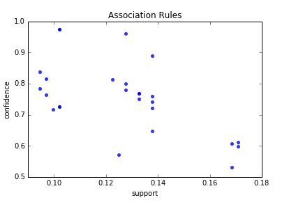
Below is the scatter plot for support and confidence:

Association rules - scatter plot
Association rules – scatter plot

And here is the python code to build scatter plot. Since few points here have the same values I added small random values to show all points.

import random
import matplotlib.pyplot as plt


for i in range (len(support)):
   support[i] = support[i] + 0.0025 * (random.randint(1,10) - 5) 
   confidence[i] = confidence[i] + 0.0025 * (random.randint(1,10) - 5)

plt.scatter(support, confidence,   alpha=0.5, marker="*")
plt.xlabel('support')
plt.ylabel('confidence') 
plt.show()

How to Create Data Visualization with NetworkX for Association Rules in Data Mining

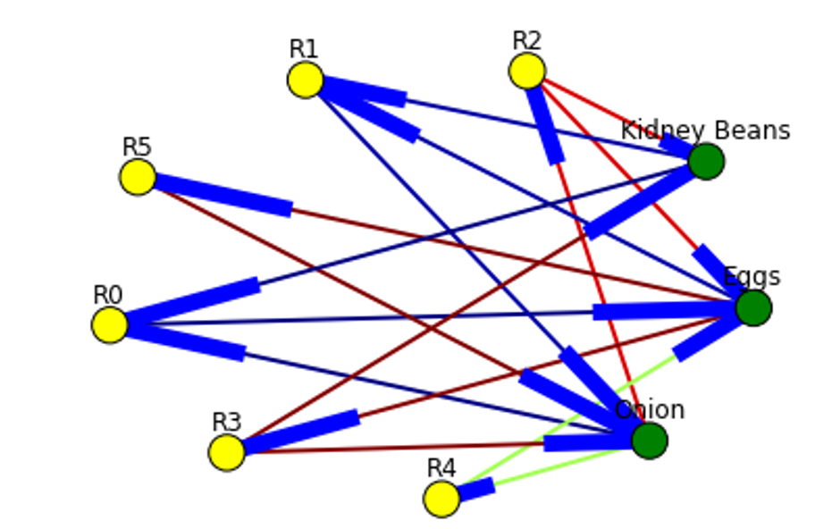
To represent association rules as diagram, NetworkX python library is utilized in this post. Here is the association rule example :
(Kidney Beans, Onion) ==> (Eggs)

Directed graph below is built for this rule and shown below. Arrows are drawn as just thicker blue stubs. The node with R0 identifies one rule, and it will have always incoming and outcoming edges. Incoming edge(s) will represent antecedants and the stub (arrow) will be next to node.

Below is the example of graph for all rules extracted from example dataset.

Here is the source code to build association rules with NetworkX. To call function use draw_graph(rules, 6)

def draw_graph(rules, rules_to_show):
  import networkx as nx  
  G1 = nx.DiGraph()
  
  color_map=[]
  N = 50
  colors = np.random.rand(N)    
  strs=['R0', 'R1', 'R2', 'R3', 'R4', 'R5', 'R6', 'R7', 'R8', 'R9', 'R10', 'R11']   
  
  
  for i in range (rules_to_show):      
    G1.add_nodes_from(["R"+str(i)])
   
    
    for a in rules.iloc[i]['antecedants']:
               
        G1.add_nodes_from([a])
       
        G1.add_edge(a, "R"+str(i), color=colors[i] , weight = 2)
      
    for c in rules.iloc[i]['consequents']:
            
            G1.add_nodes_from()
           
            G1.add_edge("R"+str(i), c, color=colors[i],  weight=2)

  for node in G1:
       found_a_string = False
       for item in strs: 
           if node==item:
                found_a_string = True
       if found_a_string:
            color_map.append('yellow')
       else:
            color_map.append('green')       


  edges = G1.edges()
  colors = [G1[u][v]['color'] for u,v in edges]
  weights = [G1[u][v]['weight'] for u,v in edges]

  pos = nx.spring_layout(G1, k=16, scale=1)
  nx.draw(G1, pos, edges=edges, node_color = color_map, edge_color=colors, width=weights, font_size=16, with_labels=False)            
  
  for p in pos:  # raise text positions
           pos[p][1] += 0.07
  nx.draw_networkx_labels(G1, pos)
  plt.show()

Data Visualization for Online Retail Data Set

To get real feeling and testing on visualization we can take available online retail store dataset[6] and apply the code for association rules graph. For downloading retail data and formatting some columns the code from [3] was used.

Below are the result of scatter plot for support and confidence. To build the scatter plot seaborn library was used this time. Also you can find below visualization for association rules (first 10 rules) for retail data set.

Here is the python full source code for data visualization association rules in data mining.


dataset = [['Milk', 'Onion', 'Nutmeg', 'Kidney Beans', 'Eggs', 'Yogurt'],
           ['Dill', 'Onion', 'Nutmeg', 'Kidney Beans', 'Eggs', 'Yogurt'],
           ['Milk', 'Apple', 'Kidney Beans', 'Eggs'],
           ['Milk', 'Unicorn', 'Corn', 'Kidney Beans', 'Yogurt'],
           ['Corn', 'Onion', 'Onion', 'Kidney Beans', 'Ice cream', 'Eggs']]
           
           
import pandas as pd
from mlxtend.preprocessing import OnehotTransactions
from mlxtend.frequent_patterns import apriori

oht = OnehotTransactions()
oht_ary = oht.fit(dataset).transform(dataset)
df = pd.DataFrame(oht_ary, columns=oht.columns_)
print (df)           

frequent_itemsets = apriori(df, min_support=0.6, use_colnames=True)
print (frequent_itemsets)

from mlxtend.frequent_patterns import association_rules

association_rules(frequent_itemsets, metric="confidence", min_threshold=0.7)
rules = association_rules(frequent_itemsets, metric="lift", min_threshold=1.2)
print (rules)

support=rules.as_matrix(columns=['support'])
confidence=rules.as_matrix(columns=['confidence'])


import random
import matplotlib.pyplot as plt


for i in range (len(support)):
   support[i] = support[i] + 0.0025 * (random.randint(1,10) - 5) 
   confidence[i] = confidence[i] + 0.0025 * (random.randint(1,10) - 5)

plt.scatter(support, confidence,   alpha=0.5, marker="*")
plt.xlabel('support')
plt.ylabel('confidence') 
plt.show()

import numpy as np

def draw_graph(rules, rules_to_show):
  import networkx as nx  
  G1 = nx.DiGraph()
  
  color_map=[]
  N = 50
  colors = np.random.rand(N)    
  strs=['R0', 'R1', 'R2', 'R3', 'R4', 'R5', 'R6', 'R7', 'R8', 'R9', 'R10', 'R11']   
  
  
  for i in range (rules_to_show):      
    G1.add_nodes_from(["R"+str(i)])
   
    
    for a in rules.iloc[i]['antecedants']:
               
        G1.add_nodes_from([a])
       
        G1.add_edge(a, "R"+str(i), color=colors[i] , weight = 2)
      
    for c in rules.iloc[i]['consequents']:
            
            G1.add_nodes_from()
           
            G1.add_edge("R"+str(i), c, color=colors[i],  weight=2)

  for node in G1:
       found_a_string = False
       for item in strs: 
           if node==item:
                found_a_string = True
       if found_a_string:
            color_map.append('yellow')
       else:
            color_map.append('green')       


  edges = G1.edges()
  colors = [G1[u][v]['color'] for u,v in edges]
  weights = [G1[u][v]['weight'] for u,v in edges]

  pos = nx.spring_layout(G1, k=16, scale=1)
  nx.draw(G1, pos, edges=edges, node_color = color_map, edge_color=colors, width=weights, font_size=16, with_labels=False)            
  
  for p in pos:  # raise text positions
           pos[p][1] += 0.07
  nx.draw_networkx_labels(G1, pos)
  plt.show()

    
draw_graph (rules, 6)   


df = pd.read_excel('http://archive.ics.uci.edu/ml/machine-learning-databases/00352/Online%20Retail.xlsx')


df['Description'] = df['Description'].str.strip()
df.dropna(axis=0, subset=['InvoiceNo'], inplace=True)
df['InvoiceNo'] = df['InvoiceNo'].astype('str')
df = df[~df['InvoiceNo'].str.contains('C')]

basket = (df[df['Country'] =="France"]
          .groupby(['InvoiceNo', 'Description'])['Quantity']
          .sum().unstack().reset_index().fillna(0)
          .set_index('InvoiceNo'))

def encode_units(x):
    if x <= 0:
        return 0
    if x >= 1:
        return 1

basket_sets = basket.applymap(encode_units)
basket_sets.drop('POSTAGE', inplace=True, axis=1)

frequent_itemsets = apriori(basket_sets, min_support=0.07, use_colnames=True)

rules = association_rules(frequent_itemsets, metric="lift", min_threshold=1)
rules.head()

print (rules)


support=rules.as_matrix(columns=['support'])
confidence=rules.as_matrix(columns=['confidence'])

import seaborn as sns1

for i in range (len(support)):
    support[i] = support[i] 
    confidence[i] = confidence[i] 
    
plt.title('Association Rules')
plt.xlabel('support')
plt.ylabel('confidence')    
sns1.regplot(x=support, y=confidence, fit_reg=False)

plt.gcf().clear()
draw_graph (rules, 10)  

References

1. MLxtend Apriori
2. mlxtend-latest
3. Introduction to Market Basket Analysis in Python
4. MLxtends-documentation
5. Association rule learning
6. Online Retail Data Set


Machine Learning Stock Prediction with LSTM and Keras – Python Source Code

Python Source Code for Machine Learning Stock Prediction with LSTM and Keras – Python Source Code with LSTM and Keras Below is the code for machine learning stock prediction with LSTM neural network.

# -*- coding: utf-8 -*-

import numpy as np
import pandas as pd
from sklearn import preprocessing
import matplotlib.pyplot as plt


fname="C:\\Users\\stock_data.csv"
data_csv = pd.read_csv (fname)

#how many data we will use 
# (should not be more than dataset length )
data_to_use= 100

# number of training data
# should be less than data_to_use
train_end =70


total_data=len(data_csv)

#most recent data is in the end 
#so need offset
start=total_data - data_to_use


#currently doing prediction only for 1 step ahead
steps_to_predict =1

 
yt = data_csv.iloc [start:total_data ,4]    #Close price
yt1 = data_csv.iloc [start:total_data ,1]   #Open
yt2 = data_csv.iloc [start:total_data ,2]   #High
yt3 = data_csv.iloc [start:total_data ,3]   #Low
vt = data_csv.iloc [start:total_data ,6]    # volume


print ("yt head :")
print (yt.head())

yt_ = yt.shift (-1)
    
data = pd.concat ([yt, yt_, vt, yt1, yt2, yt3], axis =1)
data. columns = ['yt', 'yt_', 'vt', 'yt1', 'yt2', 'yt3']
    
data = data.dropna()
    
print (data)
    
# target variable - closed price
# after shifting
y = data ['yt_']

       
#       closed,  volume,   open,  high,   low    
cols =['yt',    'vt',  'yt1', 'yt2', 'yt3']
x = data [cols]


scaler_x = preprocessing.MinMaxScaler ( feature_range =( -1, 1))
x = np. array (x).reshape ((len( x) ,len(cols)))
x = scaler_x.fit_transform (x)

   
scaler_y = preprocessing. MinMaxScaler ( feature_range =( -1, 1))
y = np.array (y).reshape ((len( y), 1))
y = scaler_y.fit_transform (y)

    
x_train = x [0: train_end,]
x_test = x[ train_end +1:len(x),]    
y_train = y [0: train_end] 
y_test = y[ train_end +1:len(y)]  
x_train = x_train.reshape (x_train. shape + (1,)) 
x_test = x_test.reshape (x_test. shape + (1,))


from keras.models import Sequential
from keras.layers.core import Dense
from keras.layers.recurrent import LSTM
from keras.layers import  Dropout


seed =2016 
np.random.seed (seed)
fit1 = Sequential ()
fit1.add (LSTM (  1000 , activation = 'tanh', inner_activation = 'hard_sigmoid' , input_shape =(len(cols), 1) ))
fit1.add(Dropout(0.2))
fit1.add (Dense (output_dim =1, activation = 'linear'))

fit1.compile (loss ="mean_squared_error" , optimizer = "adam")   
fit1.fit (x_train, y_train, batch_size =16, nb_epoch =25, shuffle = False)

print (fit1.summary())

score_train = fit1.evaluate (x_train, y_train, batch_size =1)
score_test = fit1.evaluate (x_test, y_test, batch_size =1)
print (" in train MSE = ", round( score_train ,4)) 
print (" in test MSE = ", score_test )

   
pred1 = fit1.predict (x_test) 
pred1 = scaler_y.inverse_transform (np. array (pred1). reshape ((len( pred1), 1)))


prediction_data = pred1[-1]     
   

fit1.summary()
print ("Inputs: {}".format(fit1.input_shape))
print ("Outputs: {}".format(fit1.output_shape))
print ("Actual input: {}".format(x_test.shape))
print ("Actual output: {}".format(y_test.shape))
  

print ("prediction data:")
print (prediction_data)


print ("actual data")
x_test = scaler_x.inverse_transform (np. array (x_test). reshape ((len( x_test), len(cols))))
print (x_test)


plt.plot(pred1, label="predictions")


y_test = scaler_y.inverse_transform (np. array (y_test). reshape ((len( y_test), 1)))
plt.plot( [row[0] for row in y_test], label="actual")

plt.legend(loc='upper center', bbox_to_anchor=(0.5, -0.05),
          fancybox=True, shadow=True, ncol=2)

import matplotlib.ticker as mtick
fmt = '$%.0f'
tick = mtick.FormatStrFormatter(fmt)

ax = plt.axes()
ax.yaxis.set_major_formatter(tick)


plt.show()

References
1. Machine Learning Stock Prediction with LSTM and Keras – Python Source Code with LSTM and Keras


Machine Learning Stock Prediction with LSTM and Keras

In this post I will share experiments on machine learning stock prediction with LSTM and Keras with one step ahead. I tried to do first multiple steps ahead with few techniques described in the papers on the web. But I discovered that I need fully understand and test the simplest model – prediction for one step ahead. So I put here the example of prediction of stock price data time series for one next step.

Preparing Data for Neural Network Prediction

Our first task is feed the data into LSTM. Our data is stock price data time series that were downloaded from the web.
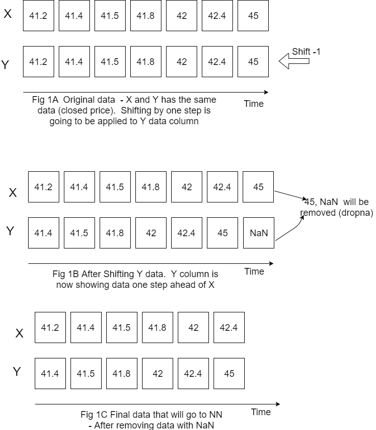
Our interest is closed price for the next day so target variable will be closed price but shifted to left (back) by one step.

Figure below is showing how do we prepare X, Y data.
Please note that I put X Y horizontally for convenience but still calling X, Y as columns.
Also on this figure only one variable (closed price) is showed for X but in the code it is actually more than one variable (it is closed price, open price, volume and high price).

LSTM data input
LSTM data input

Now we have the data that we can feed for LSTM neural network prediction. Before doing this we need also do the following things:

1. Decide how many data we want to use. For example if we have data for 10 years but want use only last 200 rows of data we would need specify start point because the most recent data will be in the end.

#how many data we will use 
# (should not be more than dataset length )
data_to_use= 100

# number of training data
# should be less than data_to_use
train_end =70


total_data=len(data_csv)

#most recent data is in the end 
#so need offset
start=total_data - data_to_use

2. Rescale (normalize) data as below. Here feature_range is tuple (min, max), default=(0, 1) is desired range of transformed data. [1]

scaler_x = preprocessing.MinMaxScaler ( feature_range =( -1, 1))
x = np. array (x).reshape ((len( x) ,len(cols)))
x = scaler_x.fit_transform (x)


scaler_y = preprocessing. MinMaxScaler ( feature_range =( -1, 1))
y = np.array (y).reshape ((len( y), 1))
y = scaler_y.fit_transform (y)

3. Divide data into training and testing set.

x_train = x [0: train_end,]
x_test = x[ train_end +1:len(x),]    
y_train = y [0: train_end] 
y_test = y[ train_end +1:len(y)]  

Building and Running LSTM

Now we need to define our LSTM neural network layers , parameters and run neural network to see how it works.

fit1 = Sequential ()
fit1.add (LSTM (  1000 , activation = 'tanh', inner_activation = 'hard_sigmoid' , input_shape =(len(cols), 1) ))
fit1.add(Dropout(0.2))
fit1.add (Dense (output_dim =1, activation = 'linear'))

fit1.compile (loss ="mean_squared_error" , optimizer = "adam")   
fit1.fit (x_train, y_train, batch_size =16, nb_epoch =25, shuffle = False)

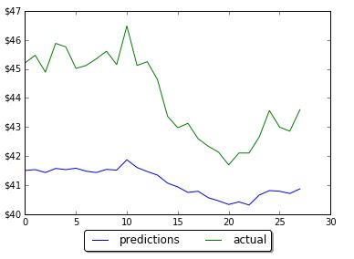
The first run was not good – prediction was way below actual.

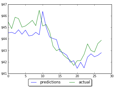
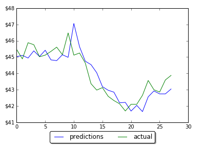
However by changing the number of neurons in LSTM neural network prediction code, it was possible to improve MSE and get predictions much closer to actual data. Below are screenshots of plots of prediction and actual data for LSTM with 5, 60 and 1000 neurons. Note that the plot is showing only testing data. Training data is not shown on the plots. Also you can find below the data for MSE and number of neurons. As the number neorons in LSTM layer is changing there were 2 minimums (one around 100 neurons and another around 1000 neurons)

Results of prediction on LSTM with 5 neurons
Forecasting one step ahead LSTM 60
Results of prediction on LSTM with 60 neurons
Forecasting one step ahead
Results of prediction on LSTM with 1000 neurons

LSTM 5
in train MSE = 0.0475
in test MSE = 0.2714831660102521

LSTM 60
in train MSE = 0.0127
in test MSE = 0.02227417068206705

LSTM 100
in train MSE = 0.0126
in test MSE = 0.018672733913263073

LSTM 200
in train MSE = 0.0133
in test MSE = 0.020082660237026824

LSTM 900
in train MSE = 0.0103
in test MSE = 0.015546535929778267

LSTM 1000
in train MSE = 0.0104
in test MSE = 0.015037054958075455

LSTM 1100
in train MSE = 0.0113
in test MSE = 0.016363980411369994

Conclusion

The final LSTM was running with testing MSE 0.015 and accuracy 97%. This was obtained by changing number of neurons in LSTM. This example will serve as baseline for further possible improvements on machine learning stock prediction with LSTM. If you have any tips or anything else to add, please leave a comment the comment box. The full source code for LSTM neural network prediction can be found here

References
1. sklearn.preprocessing.MinMaxScaler
2. Keras documentation – RNN Layers
3. How to Reshape Input Data for Long Short-Term Memory Networks in Keras
4. Keras FAQ: Frequently Asked Keras Questions
5. Time Series Prediction with LSTM Recurrent Neural Networks in Python with Keras
6.Deep Time Series Forecasting with Python: An Intuitive Introduction to Deep Learning for Applied Time Series Modeling
7. Machine Learning Stock Prediction with LSTM and Keras – Python Source Code


Prediction Data Stock Prices with Prophet

In the previous post I showed how to use the Prophet for time series analysis with python. I used Prophet for data stock price prediction. But it was used only for one stock and only for next 10 days.

In this post we will select more data and will test how accurate can be prediction data stock prices with Prophet.

We will select 5 stocks and will do prediction stock prices based on their historical data. You will get chance to look at the report how error is distributed across different stocks or number of days in forecast. The summary report will show that we can easy get accuracy as high as 96.8% for stock price prediction with Prophet for 20 days forecast.

Data and Parameters

The five stocks that we will select are the stocks in the price range between $20 – $50. The daily historical data are taken from the web.

For time horizon we will use 20 days. That means that we will save last 20 prices for testing and will not use for forecasting.

Experiment

For this experiment we use python script with the main loop that is iterating for each stock. Inside of the loop, Prophet is doing forecast and then error is calculated and saved for each day in forecast:

   model = Prophet() #instantiate Prophet
   model.fit(data);
   future_stock_data = model.make_future_dataframe(periods=steps_ahead, freq = 'd')
   forecast_data = model.predict(future_stock_data)

   step_count=0
   # save actual data 
   for index, row in data_test.iterrows():
    
     results[ind][step_count][0] = row['y']
     results[ind][step_count][4] = row['ds']
     step_count=step_count + 1
   
   # save predicted data and calculate error
   count_index = 0   
   for index, row in forecast_data.iterrows():
     if count_index >= len(data)  :
       
        step_count= count_index - len(data)
        results[ind][step_count][1] = row['yhat']
        results[ind][step_count][2] = results[ind][step_count][0] -  results[ind][step_count][1]
        results[ind][step_count][3] = 100 * results[ind][step_count][2] / results[ind][step_count][0]
      
     count_index=count_index + 1

Later on (as shown in the above python source code) we count error as difference between actual closed price and predicted. Also error is calculated in % for each day for each stock using the formula:

Error(%) = 100*(Actual-Predicted)/Actual

Results
The detailed result report can be found here. In this report you can see how error is distributed across different days. You can note that there is no significant increase in error with 20 days of forecast and the error always has the same sign for all 20 days.

Below is the summary of error and accuracy for our selected 5 stocks. Also added the column the year of starting point of data range that was used for forecast. It turn out that all 5 stocks have different historical data range. The shortest data range was starting in the middle of 2016.

prediction data stock prices with Prophet summary results
prediction data stock prices with Prophet summary of results

Overall results for accuracy are not great. Only one stock got good accuracy 96.8%.
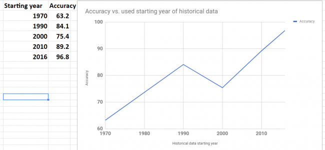
Accuracy was varying for different stocks. To investigate variation I plot graph of accuracy and beginning year of historical data. The plot is shown below. Looks like there is a correlation between data range used for forecast and accuracy. This makes sense – as the data in the further past may be do more harm than good.

Looking at the plot below we see that the shortest historical range (just about for one year) showed the best accuracy.

prediction data stock prices with Prophet - accuracy vs used data range
prediction data stock prices with Prophet – accuracy vs used data range

Conclusion
We did not get good results (except one stock) in our experiments but we got the knowledge about possible range and distribution of error over the different stocks and time horizon (up to 20 days). Also it looks promising to try do forecast with different historical data range to check how it will affect performance. It would be interesting to see if the best accuracy that we got for one stock can be achieved for other stocks too.

I hope you enjoyed this post about using Prophet for prediction data stock prices. If you have any tips or anything else to add, please leave a comment in the reply box below.

Here is the script for stock data forecasting with python using Prophet.

import pandas as pd
from fbprophet import Prophet

steps_ahead = 20
fname_path="C:\\Users\\stock data folder"

fnames=['fn1.csv','fn2.csv', 'fn3.csv', 'fn4.csv', 'fn5.csv']
# output fields: actual, predicted, error, error in %, date
fields_number = 6

results= [[[0 for i in range(len(fnames))] for j in range(steps_ahead)] for k in range(fields_number)]

for ind in range(5):
 
   fname=fname_path + "\\" + fnames[ind]
  
   data = pd.read_csv (fname)

   #keep only date and close
   #delete Open, High,	Low  , Adj CLose, Volume
   data.drop(data.columns[[1, 2, 3,5,6]], axis=1)
   data.columns = ['ds', 'y', "", "", "", "", ""]
  
   data_test = data[-steps_ahead:]
   print (data_test)
   data = data[:-steps_ahead]
   print (data)
     
   model = Prophet() #instantiate Prophet
   model.fit(data);
   future_stock_data = model.make_future_dataframe(periods=steps_ahead, freq = 'd')
   forecast_data = model.predict(future_stock_data)
   print (forecast_data[['ds', 'yhat', 'yhat_lower', 'yhat_upper']].tail(12))

   step_count=0
   for index, row in data_test.iterrows():
    
     results[ind][step_count][0] = row['y']
     results[ind][step_count][4] = row['ds']
     step_count=step_count + 1
   
  
   count_index = 0   
   for index, row in forecast_data.iterrows():
     if count_index >= len(data)  :
       
        step_count= count_index - len(data)
        results[ind][step_count][1] = row['yhat']
        results[ind][step_count][2] = results[ind][step_count][0] -  results[ind][step_count][1]
        results[ind][step_count][3] = 100 * results[ind][step_count][2] / results[ind][step_count][0]
      
     count_index=count_index + 1

for z in range (5):        
  for i in range (steps_ahead):
    temp=""
    for j in range (5):
          temp=temp + " " + str(results[z][i][j])
    print (temp)
   
   
  print (z)